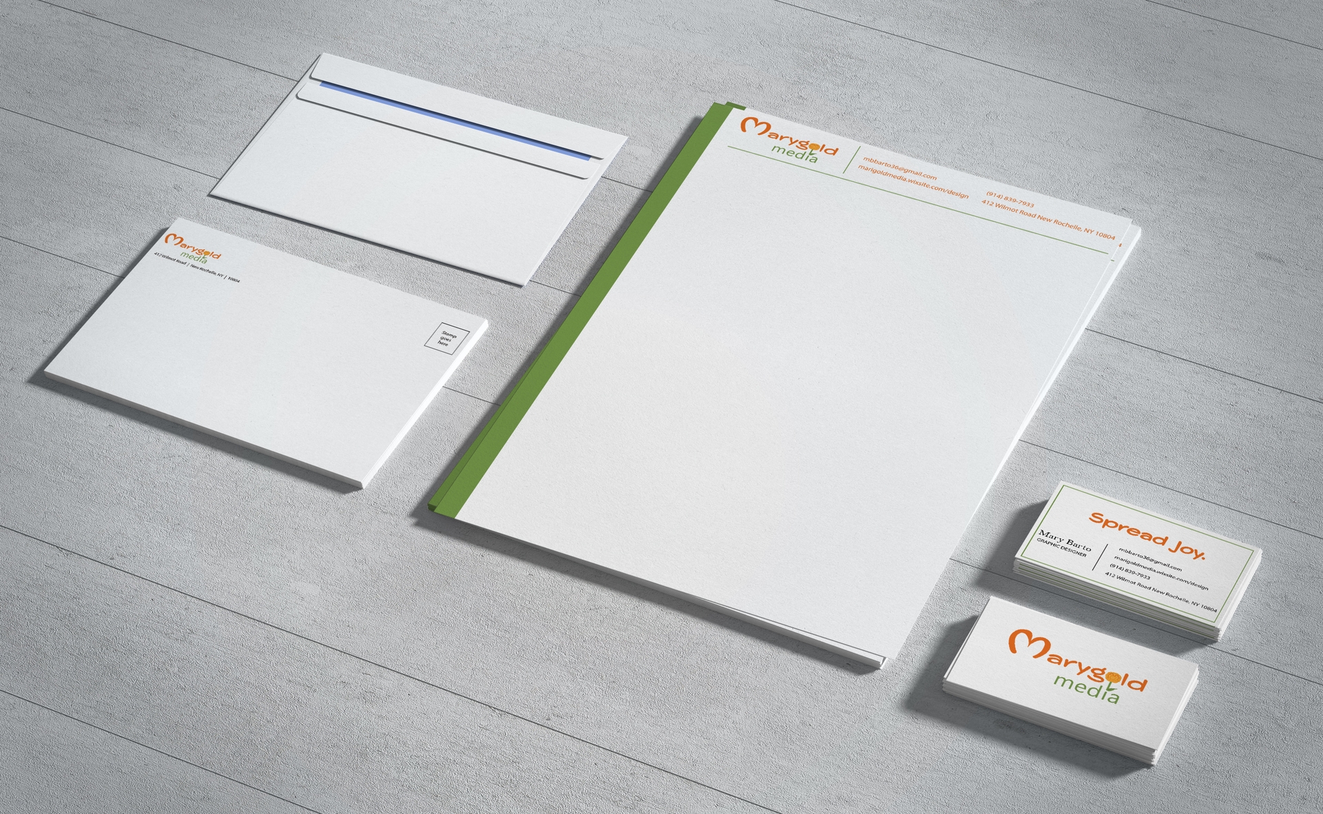
Marygold Media Stationery
These pieces of stationery represent my company's designs for the stationery that would be given out to the public. These designs were created in Adobe Illustrator and the mockups were done in Adobe Photoshop. My business card has a front and back, and the front shows the contact information, along with the company's slogan, "spread joy". The letterhead matches the design of the business card, by involving a big green line on the side of the page, with a thin line at the top of the page. The envelope is simple, and contains the logo, with the address along with where to place the stamp.
Marygold Media Collage
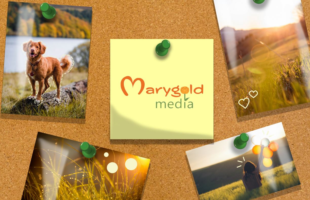
This collage was created in Adobe Photoshop, and captures the illusion of a realistic collage with photos pinned onto it. There are highlighter markings on each photo that are marked by the owner of the collage. Marygold Media is my company's name, and I pasted it onto a Post-it note. The goal of the company is to spread joy.
Upper Crust Bakery Stationery
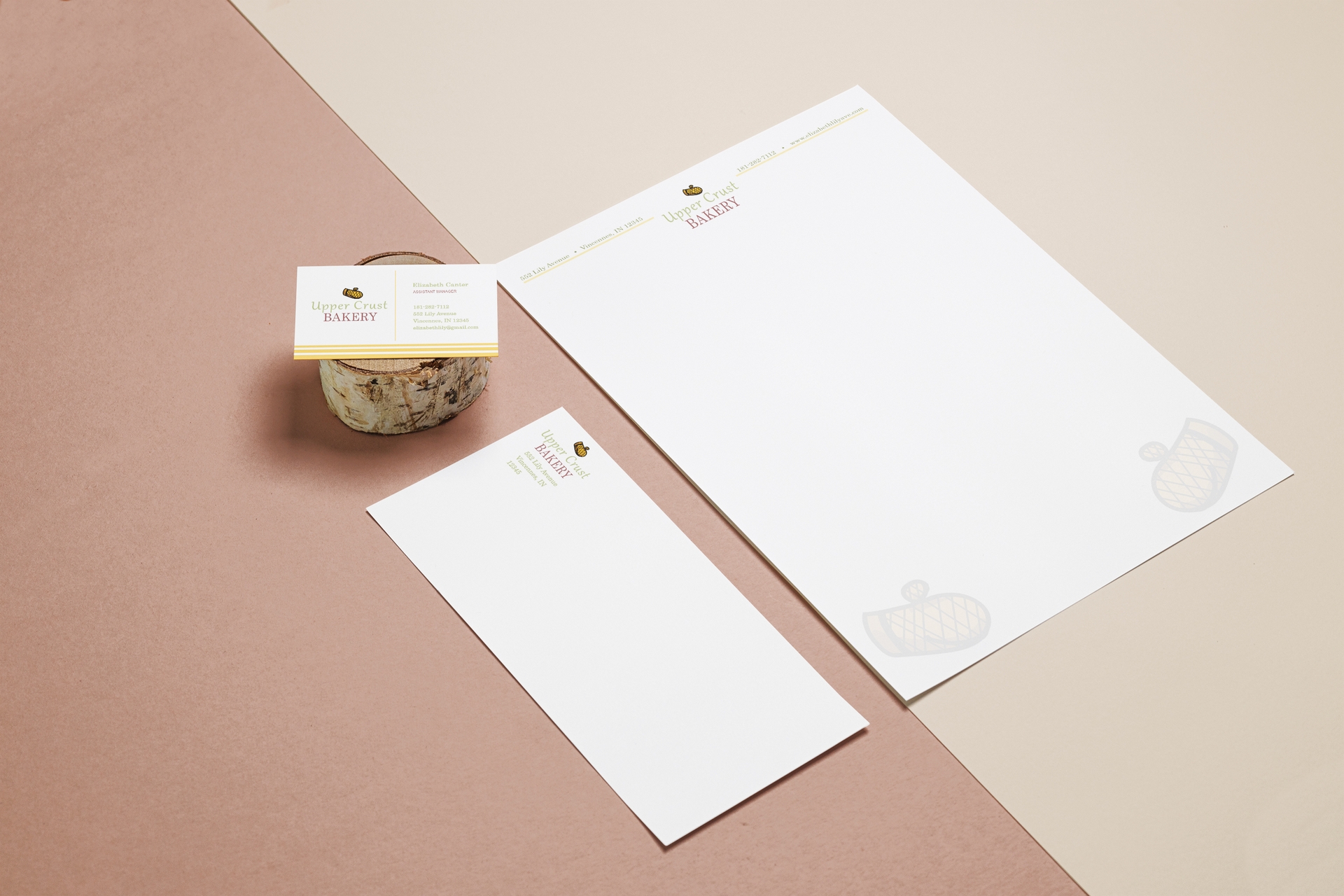
The first logo project that I had to create at SNHU contained different stationery designs for a company that I chose out of multiple fake brands. These designs were also created in Adobe Illustrator and the mockups were created in Adobe Photoshop. The business card shows three yellow lines at the bottom which represent oven lines or steam lines. The letterhead was designed with the contact information placed at the top of the paper, with the logo in the middle. I also added two transparent oven mittens that are seen in the logo at the bottom of the paper. The envelope is simple like the Marygold Media envelope design, with the contact information seen at the bottom of the logo.
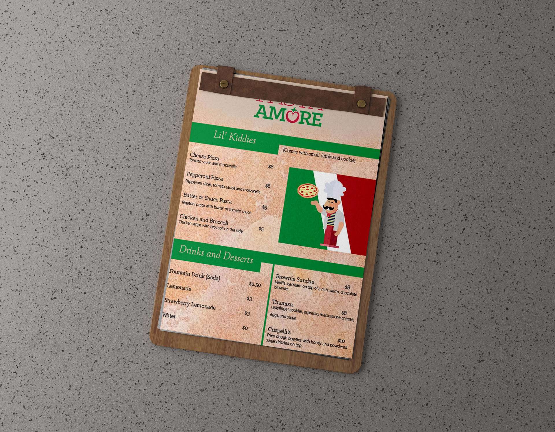
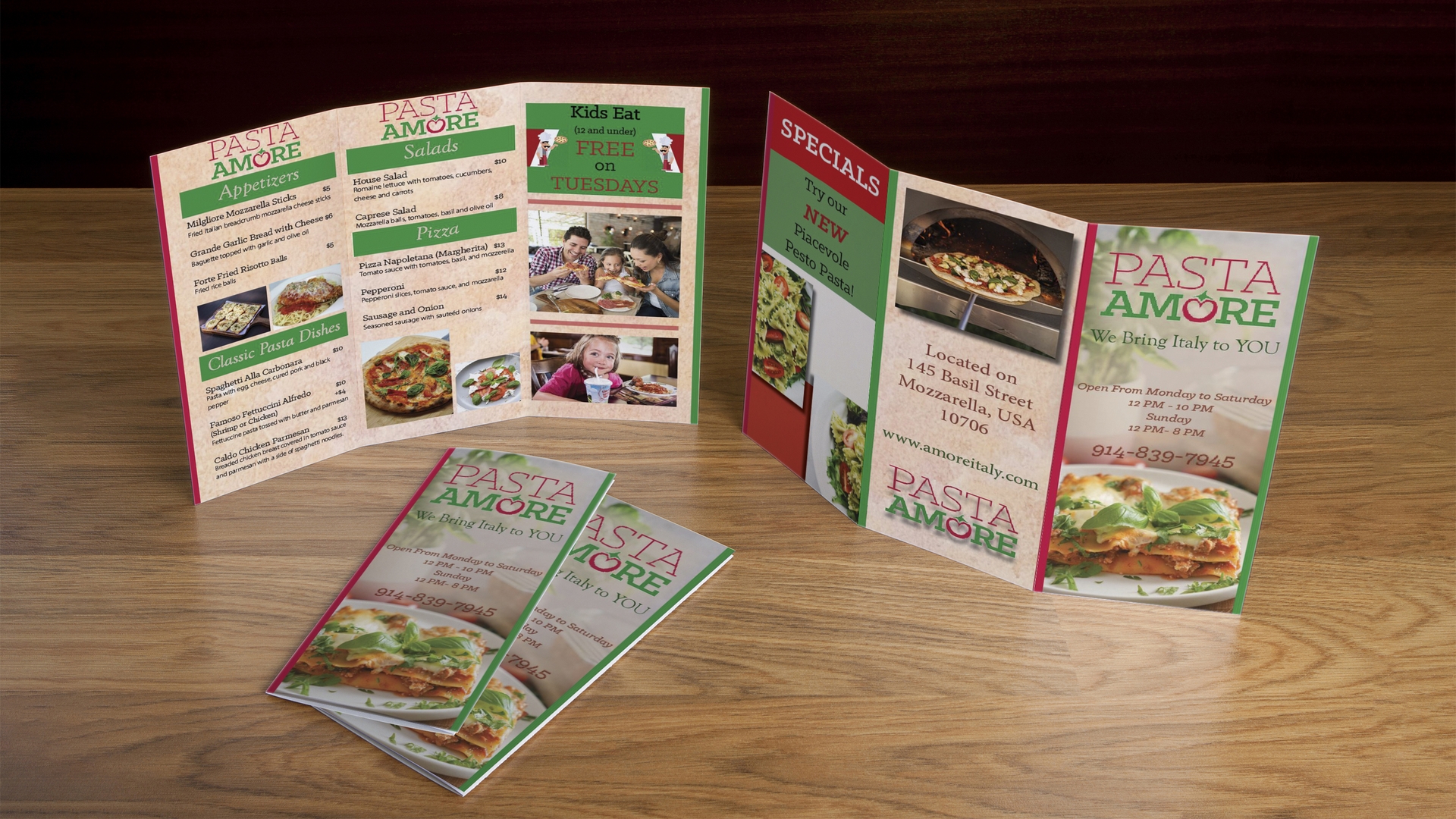
Pasta Amore Restaurant Menu,
Table Tent and Brochure
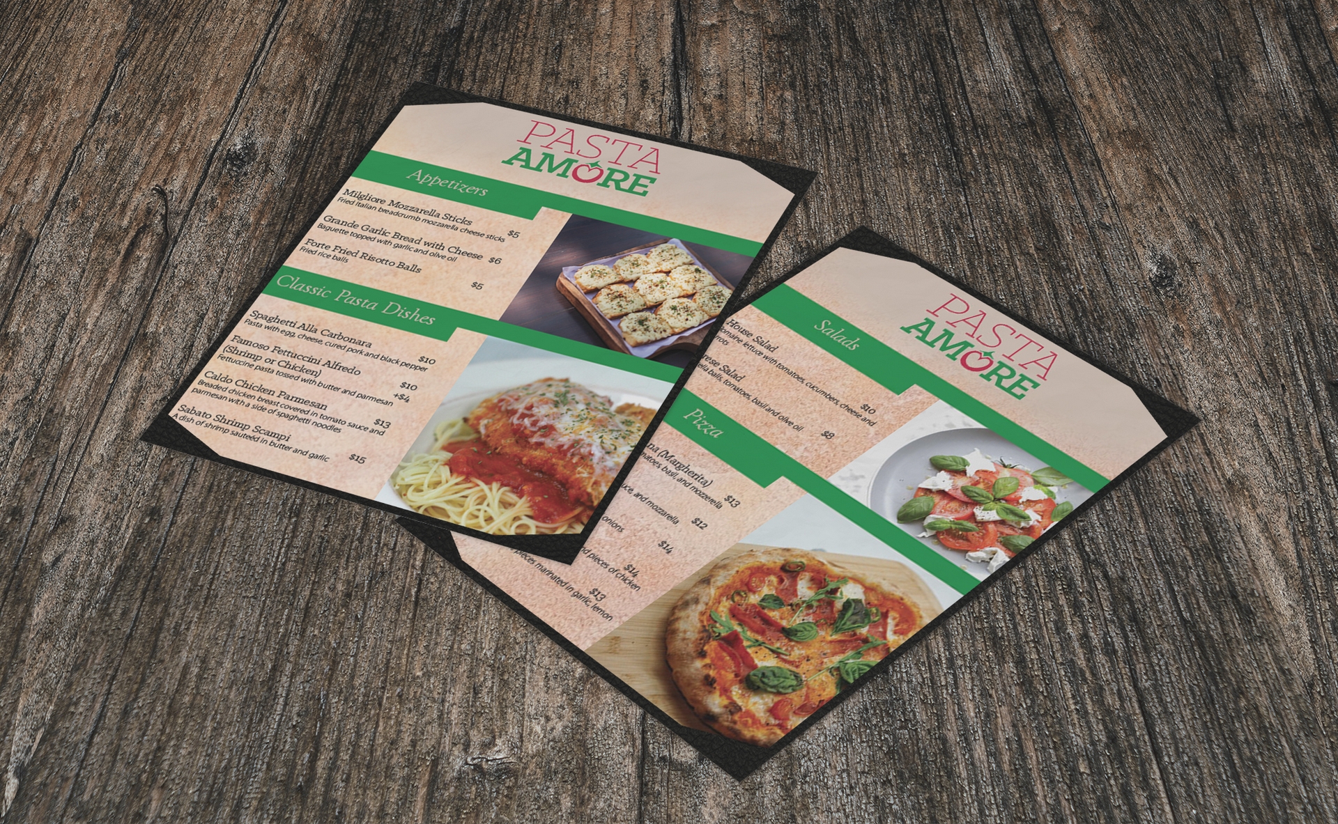
I had the choice of choosing between designing for Town or Pasta Amore, and I decided to choose Pasta Amore. The menu, table tent and brochure were created in Adobe InDesign and the mockups were done in Adobe Photoshop. I wanted to create a family-friendly restaurant feeling by adding vibrant colors and easy-to-read menu fonts. I also added a cartoon image of a chef on the kid's menu area which can be seen on the third page, so it would attract the children who read the menu and brochure. There are detailed descriptions underneath each meal choice.
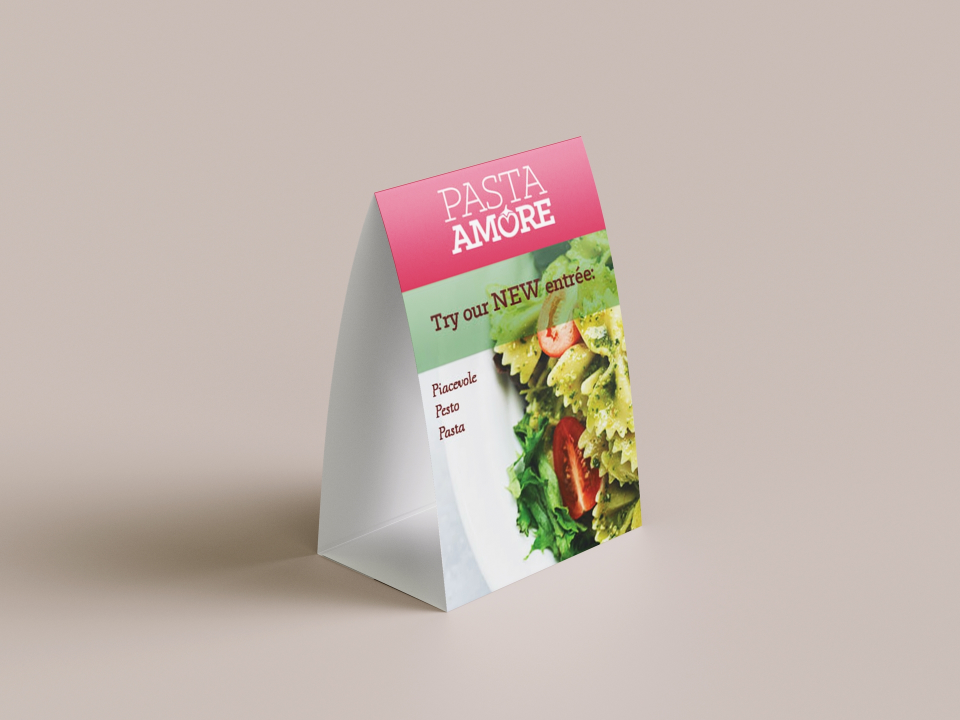
The table tent showcases the new entrée item, while including the restaurant's color palette.
The outside of the brochure portrays the address of the restaurant, the cover of the brochure with the phone number and the hours, and also the specials are seen on the back page of the brochure. Adding drop shadows behind the images allowed for them to stand out more than they would be if the shadows were not added. For my menu, I wanted to create names for the different meals that included the first letter of the meal in the first word. I wanted to add photos of a family and a child to add onto the idea of the restaurant being family-friendly.
Scarlett Johansson Typography Portrait
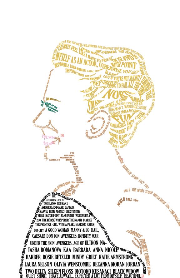
This is a typography portrait of the actress, Scarlett Johansson. All of her hair is pulled back, which is why it looks like a pixie haircut. I used Adobe Illustrator to create this portrait. The warped words in her hair portray the swoosh and flowiness of her strands. I decided to add color to the portrait to show the color of Johansson's eyes, hair, skin, lips, and dress. The words that make up the portrait are quotes that she has said, words that describe her, characters she has acted as, and movies and shows that she has starred in.
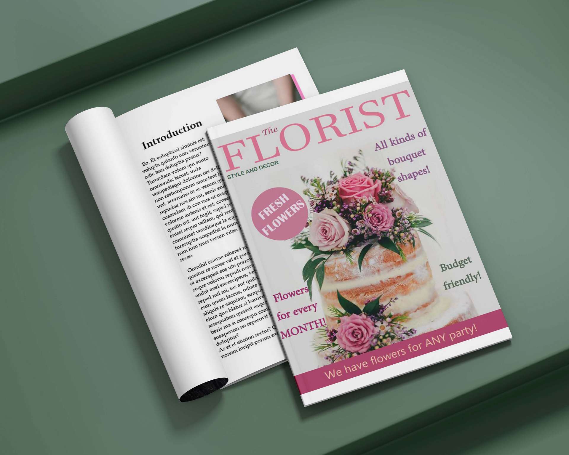
The Florist Magazine Spread
This is a magazine cover I did for a class assignment. The magazine is about bouquets that can be used for birthday parties, important events such as weddings, and also just for special holidays. I used Adobe InDesign to create the cover, and used the mockup in Adobe Photoshop. The circle with the words "fresh flowers" looks like a sticker that was smacked onto the magazine to get the viewer's attention. I created an introduction page with a photo of a wedding bouquet and a photo of pink baby's breath flowers.
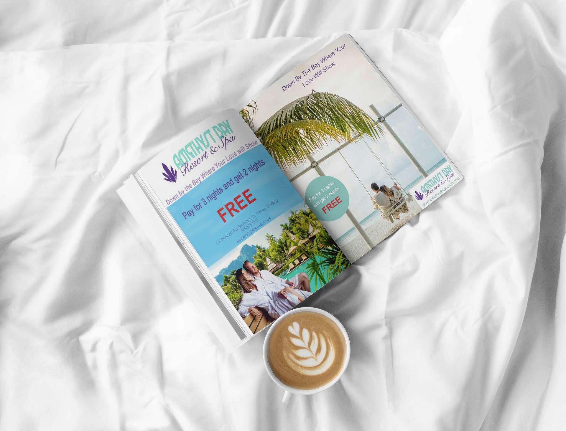
Amethyst Bay Magazine Ad and Banner Ad
This was a school project for a company called, "Amethyst Bay Resort and Spa". It was my job to come up with a slogan, so I decided "down by the bay where your love will show" as a play-on phrase for the song Down By the Bay. I used Adobe Photoshop to create both of these ads and created the mockup in the same program. The first ad I made for school is seen on the left. I wanted to
make the words big and bold to get people's attention, and especially make the word, "free" in a vibrant red color. I made the contact information with less opacity since those words are not the most important, so the visual hiearchy is strong. I composited two photos to create the one photo at the bottom of the page. I created a second page to turn the one ad into a magazine spread. There is an illusion of a sticker on the left side of the page.
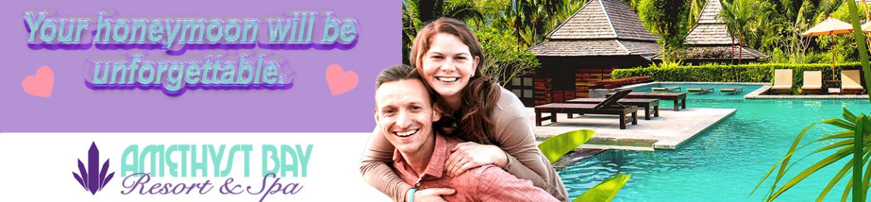
This banner ad was also created in Adobe Photoshop like the magazine ad. The color palette is almost the same, just with a purple background instead of a blue background. I used the same background image that I used in the magazine ad as well, but I added a new photo of a couple. The pink hearts add to the feeling of attracting newlyweds. I made the font bubbly and shiny just to have a unique design to an advertisement.
Cold Sweets Logo Design
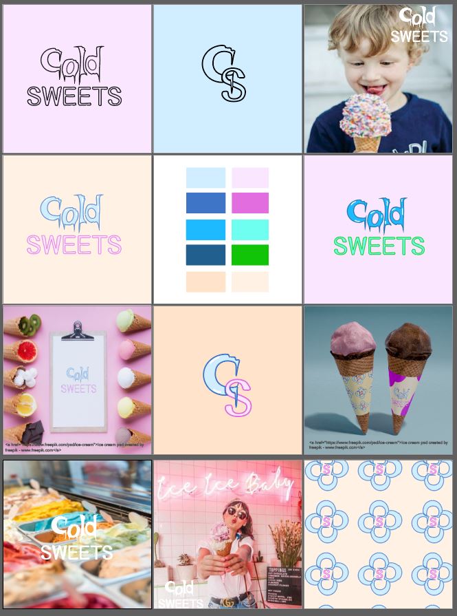
This project was a personal project where I created a brand name and its designs. Cold Sweets is an ice cream parlor that offers tons of unique flavors with vibrant colors to choose from. I used Adobe Illustrator to create this project and collage. I manipulated each letter in the logo to give it uniqueness, along with adding a cold vibe to the letters. The color palette for the logo can either be pastel, or vibrant, cold, neon colors.
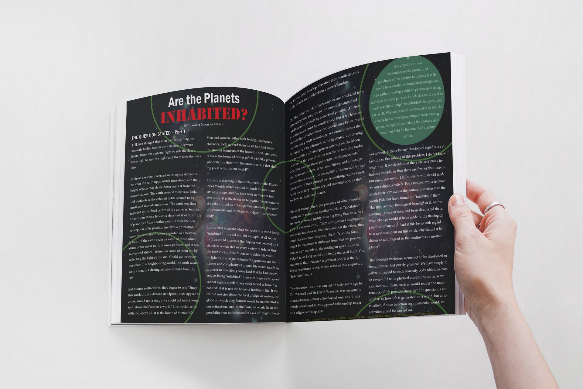
Magazine Spread
This magazine spread was created in Adobe InDesign. It is for a scientific article called Are the Planets Inhabited?. The word "inhabited" is a different font from the rest of the title and is a vibrant red so it will stand out. I added a galaxy image as the background, with green outlined circles placed all over the spread to look like UFO lines or planets. I added the credit information at the bottom of the second page in the same green as the circles.
Enchanted River Poster
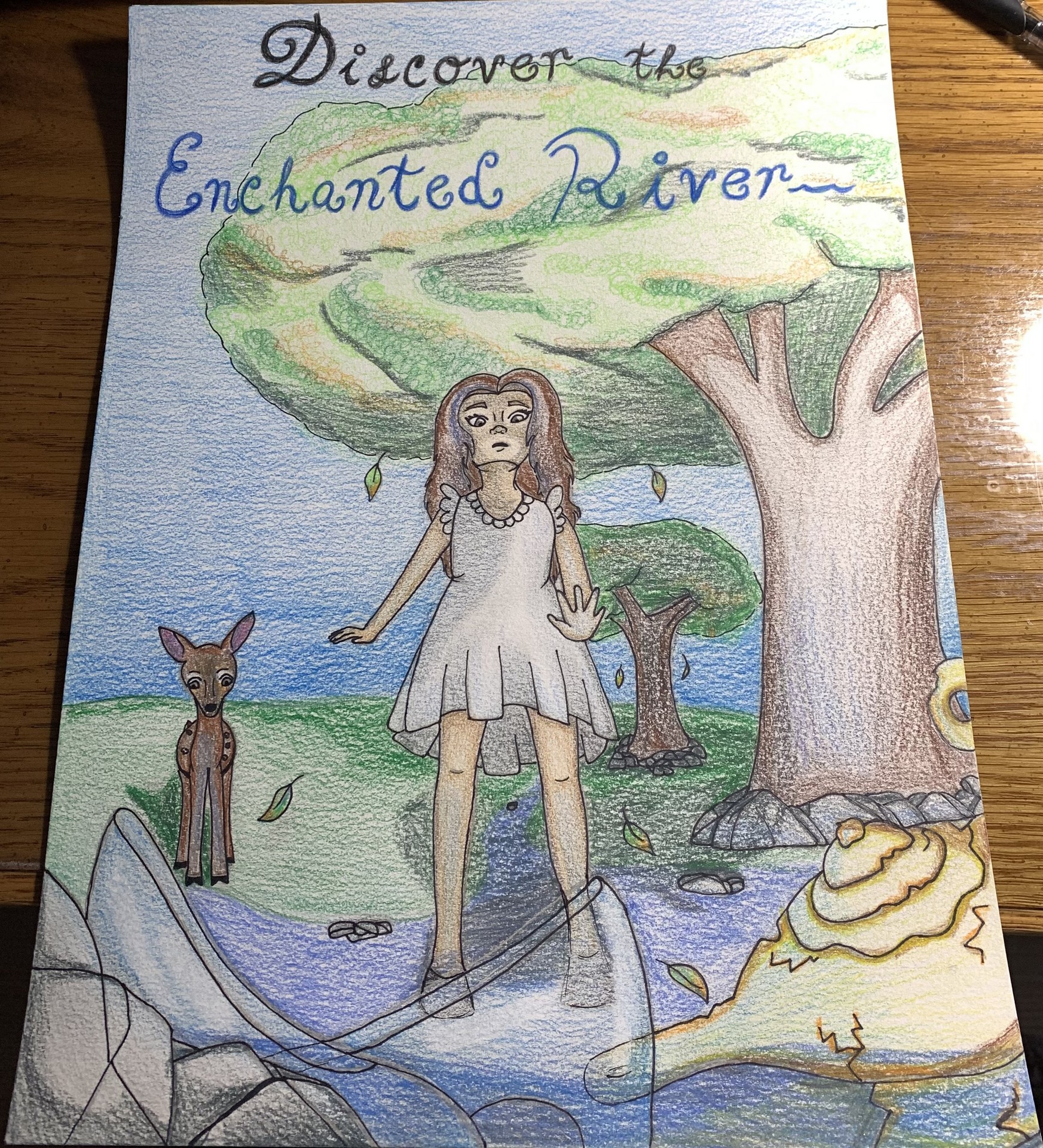
I created this travel poster for my illustration class. I had a choice of picking one story out of about 4 or 5 different ones. The mediums that were used were colored pencils and a black Sharpie. I created the drawing in three-point perspective on watercolor paper. In the river. Cinderella's slippers and Aladdin's lamp are caught on rocks, and the girl notices these objects. There is a blue highlight seen on the girl, deer, lamp and tree to show that the slippers are glowing.
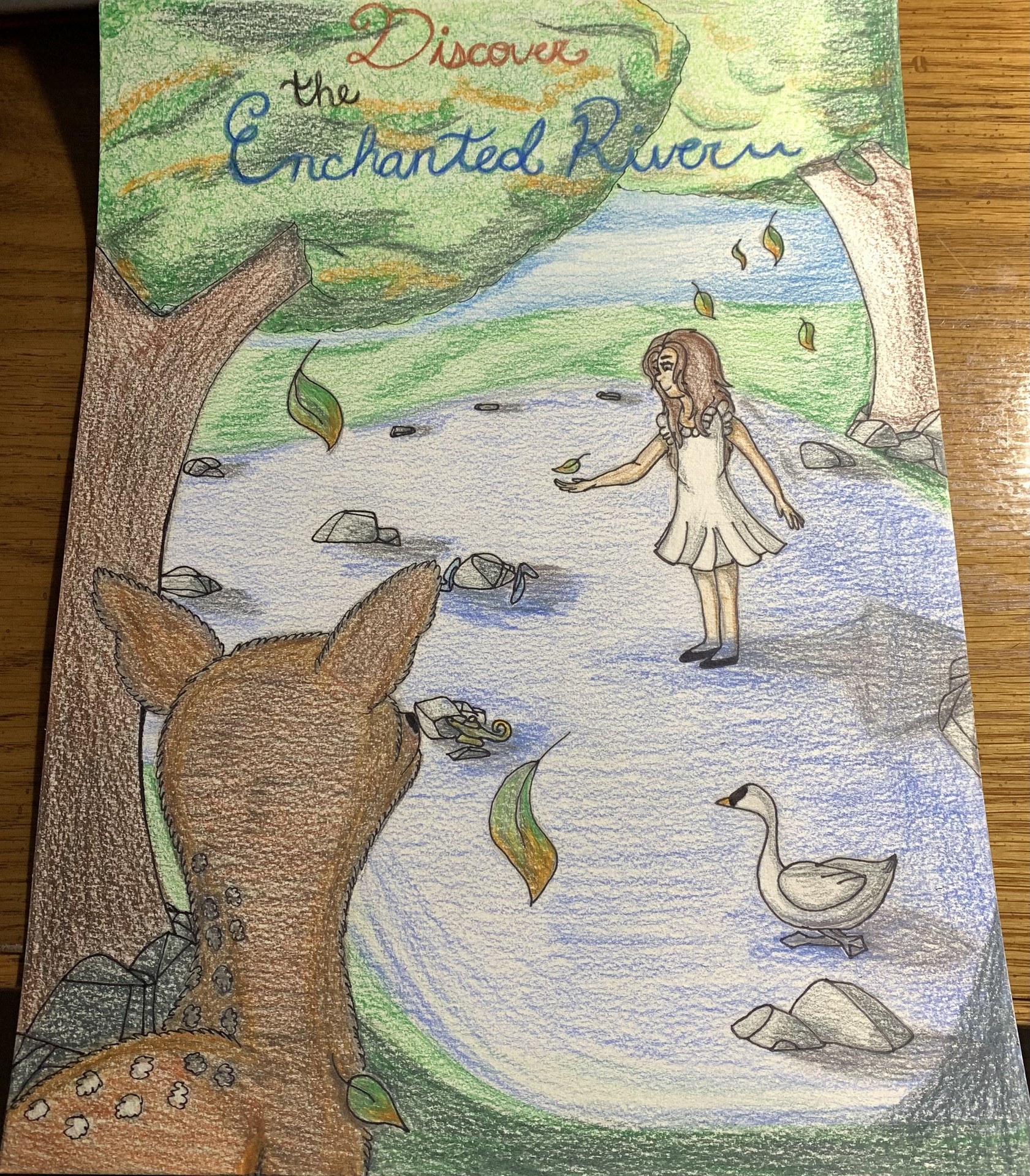
Enchanted River Poster 2
I had to make a second poster as well for The Enchanted River. I created this one with the same media as the first poster, and this was drawn in two-point perspective. The fawn is shown to be hiding behind the tree in its shadow, but it's hind end it not behind the tree. The light source is coming from the left side of the image, which is why the shadows are seen going in the right direction.
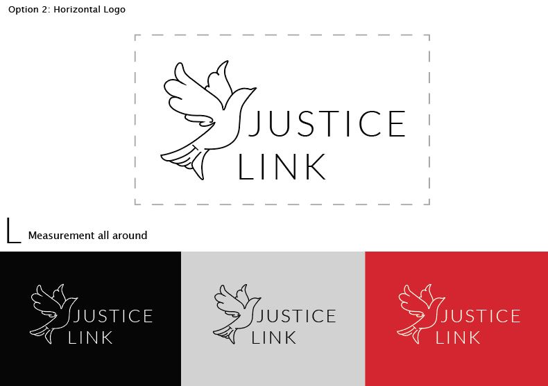
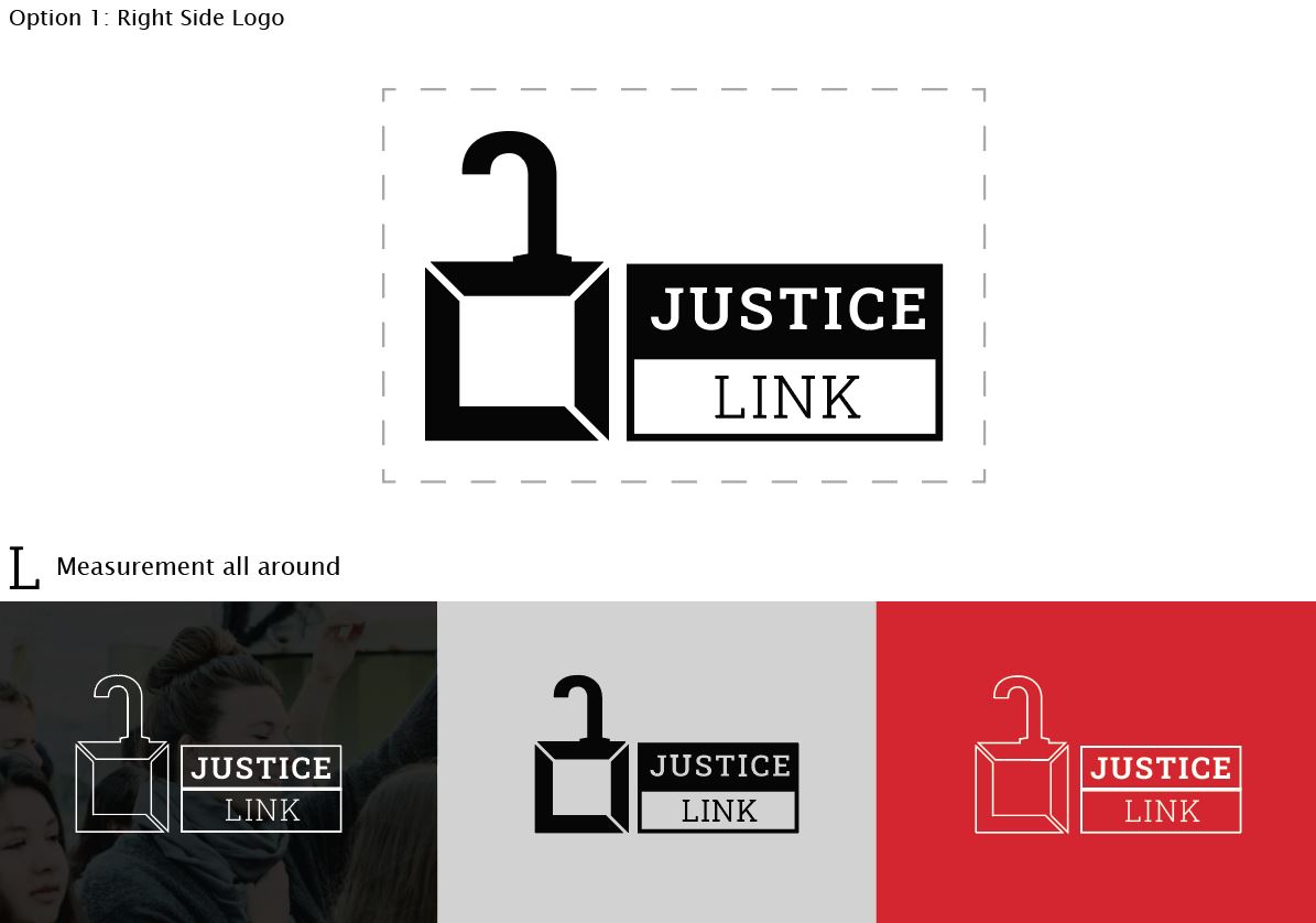
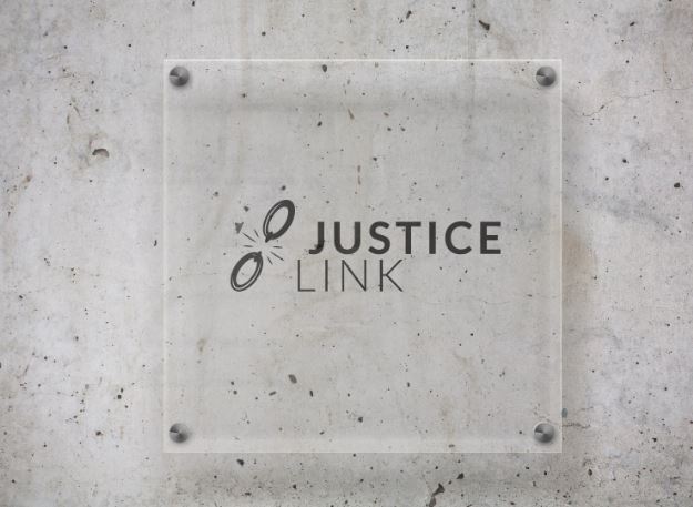
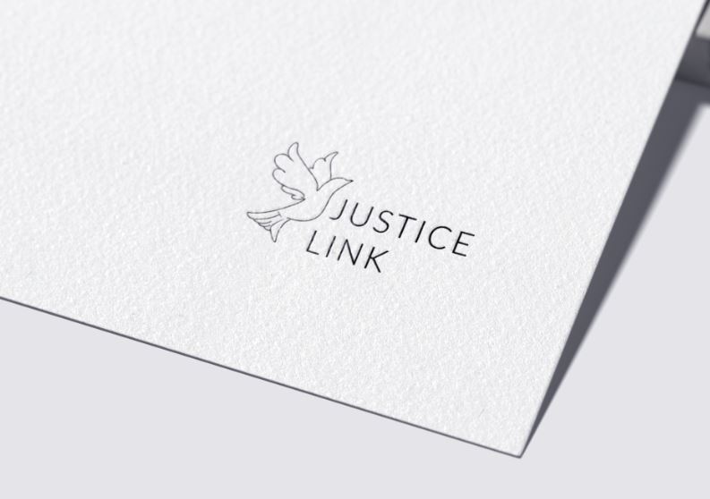
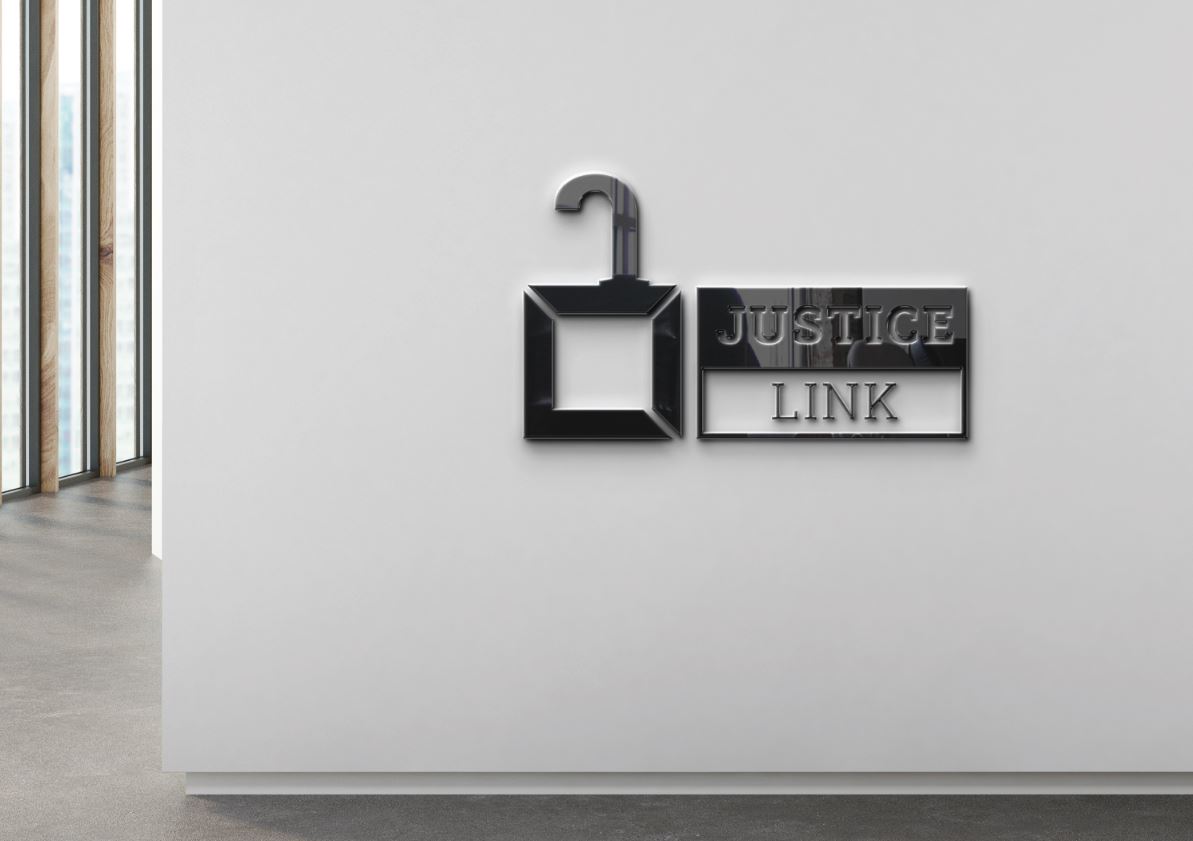
OM Justice Link Logo Designs
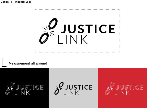
I did a four-month internship at Operation Mobilization (OM), and the designer with the title, "International Graphic Designer" assigned me to create 100 different logo sketches for Justice Link. Justice Link is an affiliation with OM that allows people to come together from all around the world who want to help human trafficking victims. I chose a variety of symbols, such as a broken chain, a dove, and a lock.
created with
Website Builder Software .